Overview
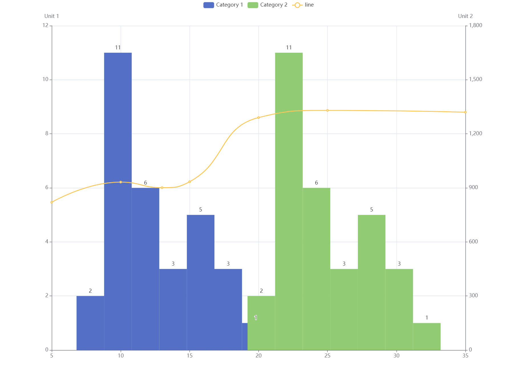
It needs some tricks and attentions when creating histogram chart with Echarts, considering the fact that there is no inbuilt histogram chart in Echarts and a bar chart component is needed.
How to create histogram chart with Echarts
Histogram chart is normally used for visualizing the distribution of data, and the data type used is continuous data.
When creating histogram chart, one important question to consider is that does a data conversion/calculation need to be done? If the data are just some raw data without any distribution/frequency calculation, the data will need some preprocessing before passing to the chart. One easy way to do this is to use a third party library called echarts-stat which could integrate with Echarts well.
1. Using third party library to do histogram data calculation
option = {
  dataset: [
    {
      source: [
        [8.3, 143],
        [8.6, 214],
        [8.8, 251],
        [10.5, 26],
        [10.7, 86],
        [10.8, 93],
        [11.0, 176],
        [11.0, 39],
        [11.1, 221],
        [11.2, 188],
        [11.3, 57],
        [11.4, 91],
        [11.4, 191],
        [11.7, 8],
        [12.0, 196],
        [12.9, 177],
        [12.9, 153],
        [13.3, 201],
        [13.7, 199],
        [13.8, 47],
        [14.0, 81],
        [14.2, 98],
        [14.5, 121],
        [16.0, 37],
        [16.3, 12],
        [17.3, 105],
        [17.5, 168],
        [17.9, 84],
        [18.0, 197],
        [18.0, 155],
        [20.6, 125]
      ]
    },
    {
      transform: {
        type: 'ecStat:histogram', // API from echarts-stat lib
        config: {}
      }
    }
  ],
  tooltip: {},
  xAxis: {
     scale: true, // important
  },
  yAxis: {},
  series: [
    {
      name: 'histogram',
      type: 'bar',  //Simply just a bar type
      barWidth: '100%',
      label: {
        show: true,
        position: 'top'
      },
      encode: { x: 0, y: 1, itemName: 4 },
      datasetIndex: 1
    }
  ]
};
2. Using calculated data to create histogram chart
If the data are already preprocessed, we can use the bar chart directly to create the histogram chart.
option = {
  tooltip:{},
  xAxis: {
     scale: true, // important
  },
  yAxis: {},
  series: [
    {
      name:"histogram",
      data: [    // histogram data that already being preprocessed
        [9, 2],
        [11, 11],
        [13, 6],
        [15, 3],
        [17, 5],
        [19, 3],
        [21, 1]
      ],
      type: 'bar', //Simply just a bar type
      barWidth: '100%',
      label: {
        show:true,
        position: 'top'
      },

    }
  ]
};
For the histogram data shown above, the first index value is the mean value of the bin/interval, and the second index value is the count/frequency of the values in that bin/interval. Something like [mid, count].
Bonus
Bonus 1: Showing multiple histogram plots in one chart
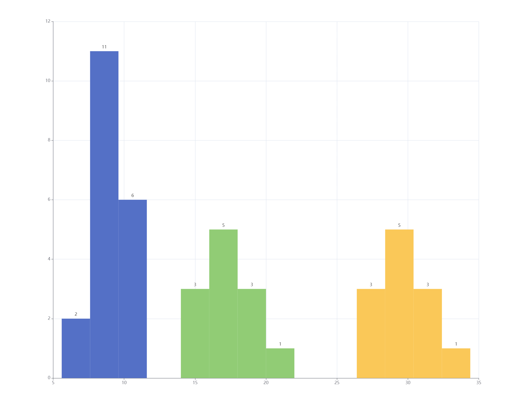
It might seems quite simple to show multiple histogram plots in one chart with using multiple bar chart series data, but the trick here is by default the xAxis value will be not in line with each plot values if there are multiple histogram plots.
- The WRONG solution with some explanationWarnings
The solution below doesn't work, it just shows that the real solution is not that simple

We can see the xAxis is not in line with the value of each plot when looking close at the series data passed to the chart within the code below.
Code
option = {
  tooltip:{},
  xAxis: {
     scale: true,
  },
  yAxis: {},
  series: [
    {
      name:"histogram1",
      data: [
        [9, 2],
        [11, 11],
        [13, 6],
      ],
      type: 'bar',
      barWidth: '100%',
      label: {
        show:true,
        position: 'top'
      },
    },
    {
      name:"histogram2",
      data: [
        [15, 3],
        [17, 5],
        [19, 3],
        [21, 1]
      ],
      type: 'bar',
      barWidth: '100%',
      label: {
        show:true,
        position: 'top'
      },
    },
    {
      name:"histogram3",
      data: [
        [25, 3],
        [27, 5],
        [29, 3],
        [31, 1]
      ],
      type: 'bar',
      barWidth: '100%',
      label: {
        show:true,
        position: 'top'
      },
    }
  ]
};
- The real solution
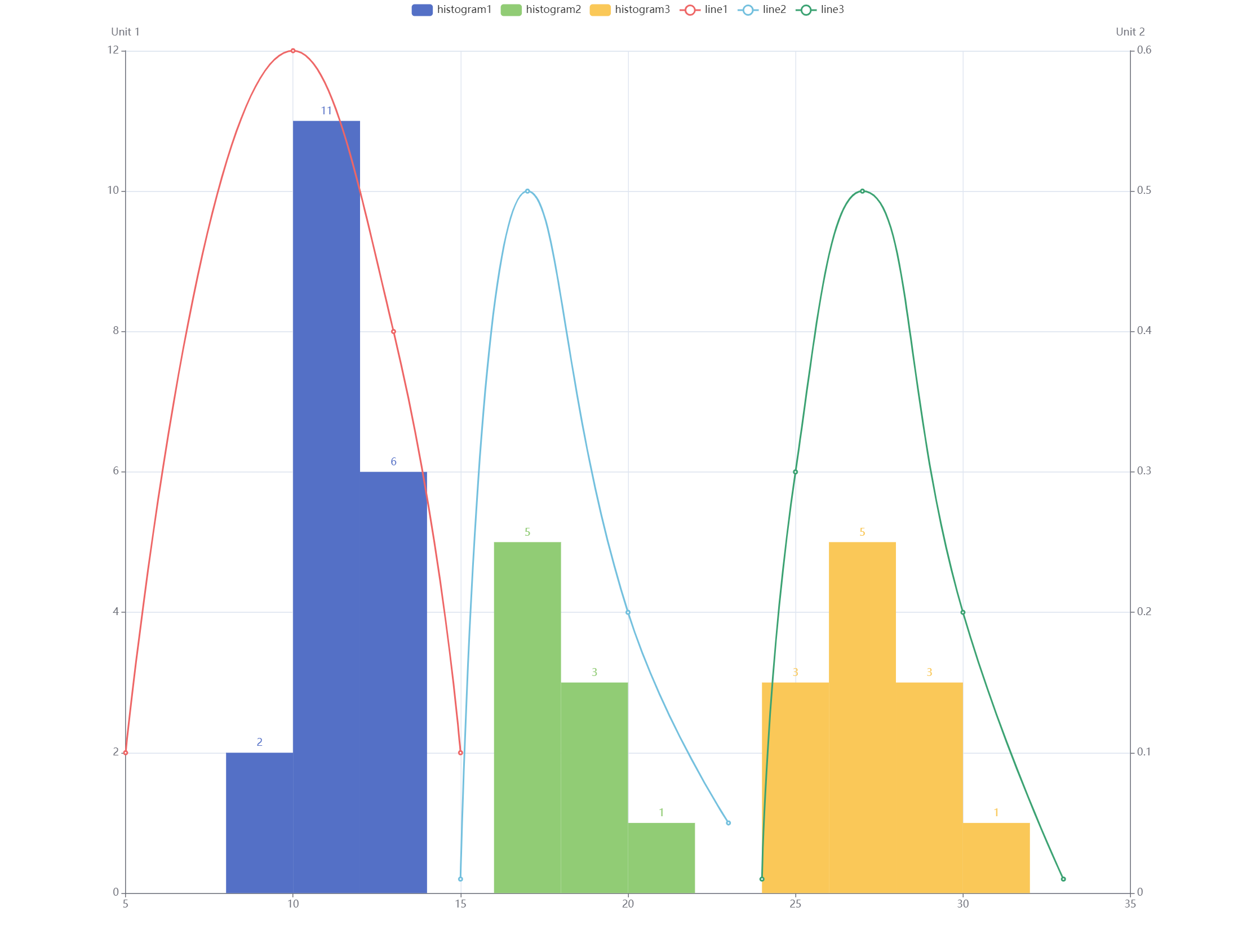
We need to use custom chart with its own render function renderItem provided by Echarts to achieve this. We also need to update the data structure a little bit in order to make it work. The code is below:
As we can see, the data structure is something like this
[mid, count, min, max]now
option = {
  tooltip:{},
  xAxis: {
     scale: true,
  },
  yAxis: {},
  series: [
    {
      name:"histogram1",
      data: [
        [9, 2, 8, 10],    // Updated data structure
        [11, 11, 10, 12],
        [13, 6, 12, 14],
      ],
      type: 'custom',
      renderItem: (params, api) => {
        const yValue = api.value(1);
        const start = api.coord([api.value(2), yValue]);
        const size = api.size([api.value(3) - api.value(2), yValue]);
        const style = api.style();
        return {
          type: 'rect',
          shape: {
            x: start[0],
            y: start[1],
            width: size[0],
            height: size[1]
          },
          style: style
        };
      },
      barWidth: '100%',
      label: {
        show:true,
        position: 'top'
      },
    },
    {
      name:"histogram2",
      data: [
        [17, 5, 16, 18],
        [19, 3, 18, 20],
        [21, 1, 20, 22]
      ],
      type: 'custom',
      renderItem: (params, api) => {
        const yValue = api.value(1);
        const start = api.coord([api.value(2), yValue]);
        const size = api.size([api.value(3) - api.value(2), yValue]);
        const style = api.style();
        return {
          type: 'rect',
          shape: {
            x: start[0],
            y: start[1],
            width: size[0],
            height: size[1]
          },
          style: style
        };
      },
      barWidth: '100%',
      label: {
        show:true,
        position: 'top'
      },
    },
    {
      name:"histogram3",
      data: [
        [25, 3, 24, 26],
        [27, 5, 26, 28],
        [29, 3, 28, 30],
        [32, 1, 30, 32]
      ],
      type: 'custom',
      renderItem: (params, api) => {
        const yValue = api.value(1);
        const start = api.coord([api.value(2), yValue]);
        const size = api.size([api.value(3) - api.value(2), yValue]);
        const style = api.style();
        return {
          type: 'rect',
          shape: {
            x: start[0],
            y: start[1],
            width: size[0],
            height: size[1]
          },
          style: style
        };
      },
      barWidth: '100%',
      label: {
        show:true,
        position: 'top'
      },
    }
  ]
};
Bonus 2: Combine histogram chart and line chart together with duplex yAxis
It's possible to combine the histogram chart and line chart (or other type of charts) with duplex yAxis.

Code
option = {
  tooltip:{},
  xAxis: {
     scale: true,
  },
  yAxis: {},
  series: [
    {
      name:"histogram1",
      data: [
        [9, 2, 8, 10],    // Updated data structure
        [11, 11, 10, 12],
        [13, 6, 12, 14],
      ],
      type: 'custom',
      renderItem: (params, api) => {
        const yValue = api.value(1);
        const start = api.coord([api.value(2), yValue]);
        const size = api.size([api.value(3) - api.value(2), yValue]);
        const style = api.style();
        return {
          type: 'rect',
          shape: {
            x: start[0],
            y: start[1],
            width: size[0],
            height: size[1]
          },
          style: style
        };
      },
      barWidth: '100%',
      label: {
        show:true,
        position: 'top'
      },
    },
    {
      name:"histogram2",
      data: [
        [17, 5, 16, 18],
        [19, 3, 18, 20],
        [21, 1, 20, 22]
      ],
      type: 'custom',
      renderItem: (params, api) => {
        const yValue = api.value(1);
        const start = api.coord([api.value(2), yValue]);
        const size = api.size([api.value(3) - api.value(2), yValue]);
        const style = api.style();
        return {
          type: 'rect',
          shape: {
            x: start[0],
            y: start[1],
            width: size[0],
            height: size[1]
          },
          style: style
        };
      },
      barWidth: '100%',
      label: {
        show:true,
        position: 'top'
      },
    },
    {
      name:"histogram3",
      data: [
        [25, 3, 24, 26],
        [27, 5, 26, 28],
        [29, 3, 28, 30],
        [32, 1, 30, 32]
      ],
      type: 'custom',
      renderItem: (params, api) => {
        const yValue = api.value(1);
        const start = api.coord([api.value(2), yValue]);
        const size = api.size([api.value(3) - api.value(2), yValue]);
        const style = api.style();
        return {
          type: 'rect',
          shape: {
            x: start[0],
            y: start[1],
            width: size[0],
            height: size[1]
          },
          style: style
        };
      },
      barWidth: '100%',
      label: {
        show:true,
        position: 'top'
      },
    },
     {
      name:"line1",
      yAxisIndex: 1,
      data: [
        [5, 0.1],
        [10, 0.6],
        [13, 0.4],
        [15, 0.1]
      ],
      type: 'line',
      smooth: true
    },
    {
      name:"line1",
      yAxisIndex: 1,
      data: [
        [15, 0.01],
        [17, 0.5],
        [20, 0.2],
        [23, 0.05]
      ],
      type: 'line',
      smooth: true
    },
    {
      name:"line1",
      yAxisIndex: 1,
      data: [
       [24, 0.01],
      [25, 0.3],
      [27, 0.5],
      [30, 0.2],
      [33, 0.01]
      ],
      type: 'line',
      smooth: true
    }
  ]
};
Final Thoughts
Histogram chart could be created directly using the bar chart component in Echarts with some minor configuration changes. It is also quite flexible to choose doing the data preprocessing with using a third party library like echarts-stat or not.
