Overview
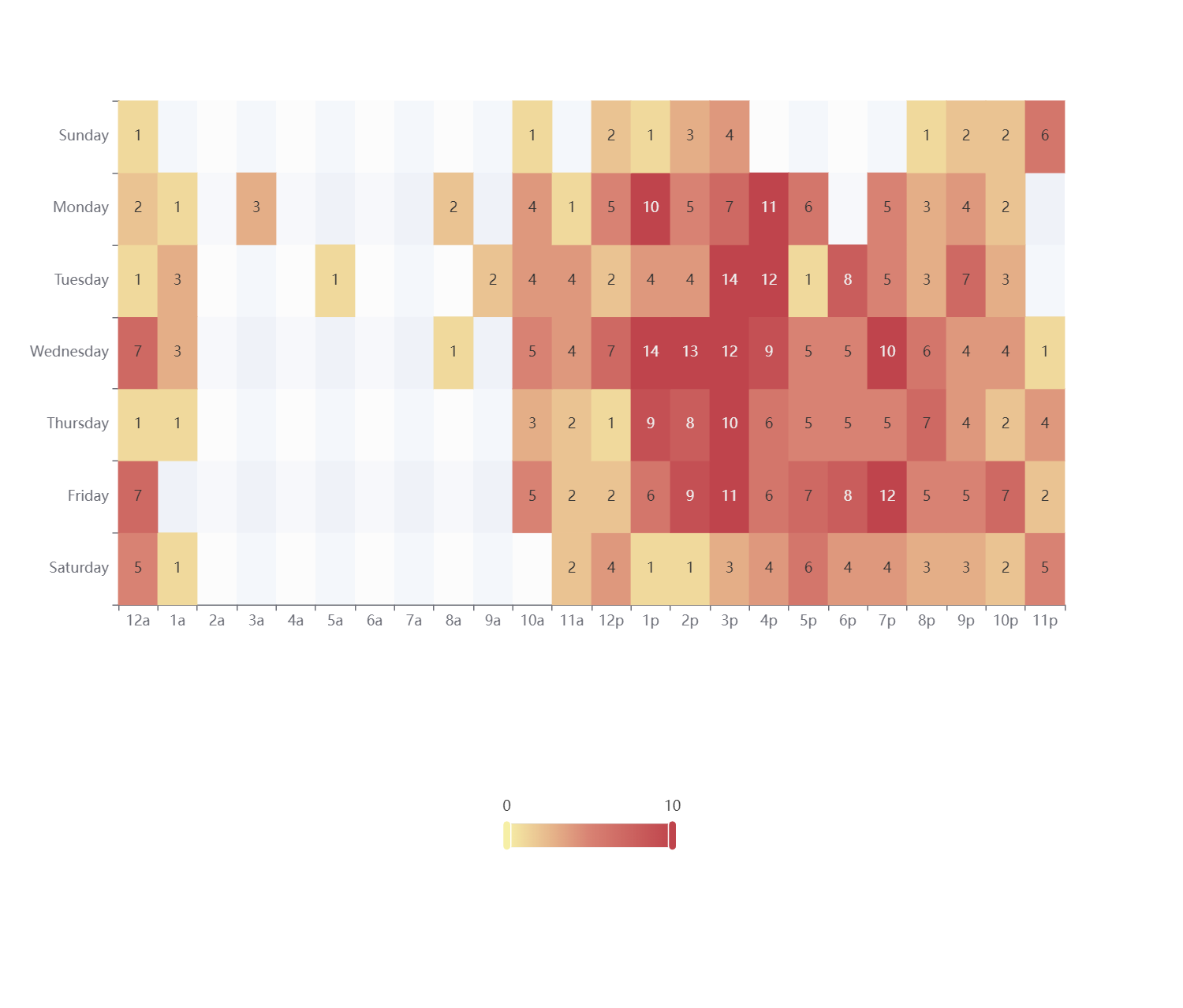
Creating a heatmap chart in Echarts typically involves utilizing the series.data property in conjunction with the xAxis.data and yAxis.data properties. However, this method often requires many data manipulation and lacks flexibility. This article sets out to investigate an alternative approach to crafting more adaptable and potent heatmap charts in Echarts with React, a technique not covered in the official documentation.
The conventional approach
The conventional method of supplying data to a heatmap chart component through series.data, xAxis.data, and yAxis.data results in a structure like the following:
<HeatmapChart
  chartConfig={{
    xAxis: {
      type: "category",
      data: convertXAxisData(data),
    },
    yAxisConfig: {
      type: 'category',
      data: convertYAxisData(data),
    },
    visualMap: {
      min: 0,
      max: 1,
    },
    series: [{
      type: 'heatmap',
      data: convertSeriesData(data),
      label: {
        show: true
      }
    }]
  }}
/>
There are two main issues with using this method above:
- More data manipulation are needed
convertXAxisData(data),convertYAxisData(data), andconvertSeriesData(data)are all data manipulation needed. - Not possible to meet some special requirements
One common requirement it cannot meet is to show labels which is a specific field of the series data rather than values. Even though we can make the label work with using
series.label.formatter, but the visual map and the color of the chart will stop working in that case. The root cause lies in the inability to assign specific fields or dimensions of the series data usingseries.data(Even though dimensions withinseries.datacan be customized, but not working as expected).
The Alternatives
An alternative, more versatile approach involves utilizing the dataset property. This method eliminates the need for data manipulation concerning xAxis and yAxis. Furthermore, it offers the ability to customize which fields or dimensions of the dataset should be displayed within the chart. By employing the dataset property, you gain a higher level of control over the chart's configuration and presentation, while simultaneously reducing the preprocessing steps associated with traditional methods. This paves the way for more adaptable and powerful heatmap charts that can readily meet diverse requirements.
<HeatmapChart
  chartConfig={{
    xAxis: {
      type: "category",
    },
    yAxisConfig: {
      type: 'category',
    },
    visualMap: {
      min: 0,
      max: 1,
    },
    dataset: {
      dimensions: ["field1", "field2", "field3"],
      source: data, //  data structure can be seen below
    },
    series: [{
      type: 'heatmap',
      encode: {
        x: 'field1',
        y: 'field2',
        value: 'field3'
      }
      label: {
        show: true
        formatter: (params) => {
          return params.value.SPECIFIC_FIELD // Making the heatmap chart show the labels defined in the SPECIFIC_FIELD
        }
      }
    }]
  }}
/>

// The data structure of the data within `dataset.source` is:
{
  "field1": [],
  "field2": [],
  "field3": [],
  "SPECIFIC_FIELD": []
}
This approach is more flexible and powerful than using series.data. It's not documented or exampled in the official documentation.
Retro
With the integration of the dataset property, the customization of heatmap charts in Echarts has reached a new level. This property effectively replaces the conventional use of series.data, xAxis.data, and yAxis.data.
Future Improvements
- Expand the utilization of the dataset property, particularly exploring functionalities like transform. This feature could streamline the data transformation process, making it easier to achieve diverse chart requirements.
